Hello all, yes, it’s been a while. I’ve been using Instagram these days to show most of my new work, (please follow me if you’d like to see what’s new!) since it’s so much easier to post a photograph with a simple caption, than compose a complete story on this platform, however, this is a good place to share more information behind the scenes of particular paintings when I’ve remembered to document the process.
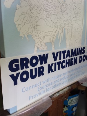
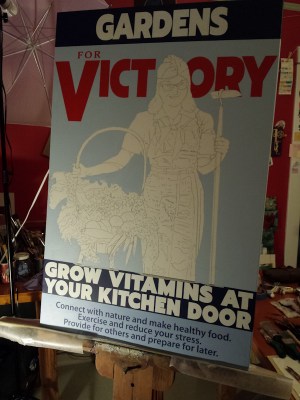
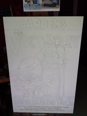
A big project this summer was a commissioned painting inspired by a poster from the early 20th century. The collector requested his wife’s face be used instead of the original and some of the poster’s words were changed or updated to personalize it further. This painting is 24x 36 inches and it was a terrific and fun challenge working with the 7 snapshots of the model emailed to me from the collector — I ended up using several to help paint her face & hair. I had to work with lettering, and then decipher the pixelated fruit and veggies in the basket from a small online image of the antique poster.
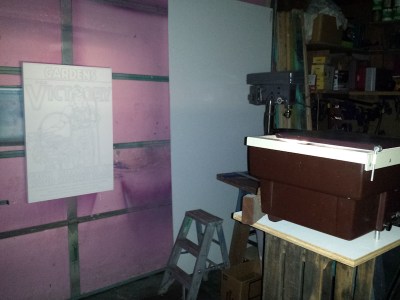
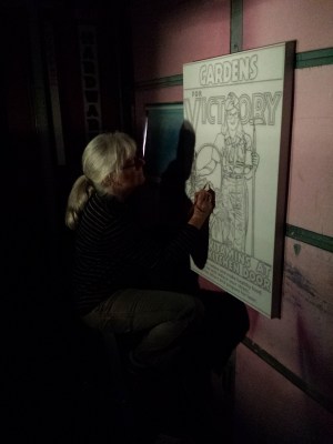
I used Photoshop initially to formulate the image, drew my own sketches of the model’s face, and then used my husband’s opaque projector to enlarge the final design onto the canvas so I could then draw around the outlines with charcoal.
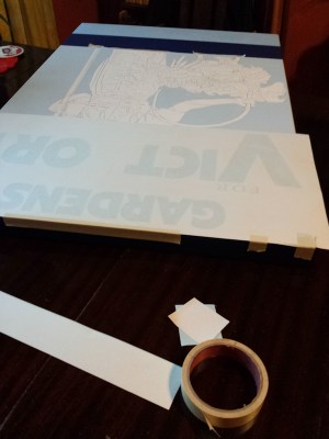
I also enlisted my husband’s sign expertise and his laser cutting machine to make vinyl stencils I could adhere to the canvas so I could paint the lettering as tight and clean as needed. Once those stencils were made, I painted the background colors using acrylic paint behind each of the word panels and the background behind the figure, saving each mixed blue color of paint in case touch-up was needed.


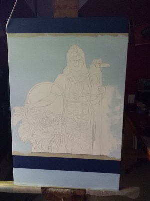

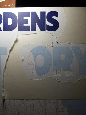
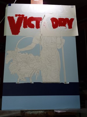
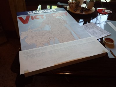
After the background was dry, I carefully stuck the top vinyl stencil to the painted canvas & hoped it was adhered tight enough to prevent paint from oozing under the stencil (tricky with a textured canvas) but not too tight it would pull off the recently painted background. I painted 3 coats of acrylic paint on the letters, carefully brushing away from the stencil edge, then let it dry before gently removing the stencil, and was so pleased it didn’t remove the background paint! The letter edges were much more crisp than I expected with only minimal touch-up needed once the vinyl stencil was removed. Yay! Those small letters at the bottom of the canvas were the scariest, since I couldn’t brush away from the edges of the stencil like I had in the larger letters. Once again, they came out much better than expected, even with 3 layers of paint! There was some bleeding underneath, but not nearly as much as I thought there might be! Celebration time! Check out the next blog post to see part 2 of this painting’s process.